
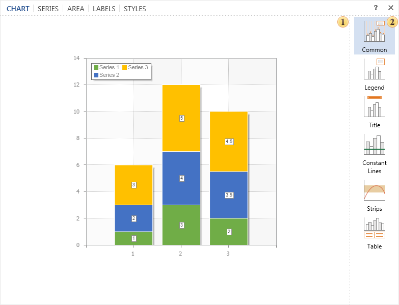
For each row, you can select the left axis or right axis Y for the plot. Attachment to the chart's axes depends on and is binding on some Axis Y (Axis Y) properties, depending on the value of this property. It binds to the left axis when this property is set to Left Axis Y (Left Y Axis) and to the right when the property is set to Right Axis Y (Right Y Axis). This feature is typically used to display charts of various types of series. Let's take an example and consider it in more detail. Create a chart containing data on global economic growth in 2006 and 2008. Data for 2008 are shown as histograms and for 2006 as lines. In this case, leave the chart datum as default, left axis Y. The following illustration shows the resulting diagram.
As can be seen from the figure, global economic growth by region was generally higher in 2006 than in 2008. In this case, the report generator will generate the left y-axis by selecting the maximum value of those columns of data. From the row associated with it, i.e. column data for bar charts and lines. Then create a graph for axis Y. If the right Y-axis is enabled, the values of this axis will be replicated to the left Y-axis. Slightly modifying the example, set the number of anchor lines (lines) as follows: Create a graph with a right y-axis. The following figure shows the left and right axis Y, the diagram with reference to different series.
As can be seen from the figure, the value and dynamics of global economic growth have not changed. However, the left and right Y-axis values are not the same. In this case, the report generator is created based on the left y-axis maximum value, i.e. the histogram maximum value and the right axis y- maximum value of the column of the data series associated with the left axis. line. Note also that you can specify different axes for series of the same type. The figure below shows two figures (left side - both series are associated with the left axis Y, right side - the first row is connected to the left axis and the second row to the right) :
We can better see the growth (or loss) dynamics, as seen in the figure where the binding is on a single axis, but at the same time, if one series has a large value, the second is rather small, so we can see it on a different axis. Must be used to bind. This allows you to visualize even the smallest value. Also, you should understand that rows of stacked rows joining on different axis Y are not correct. This is because it conflicts with how the accumulation is graphed.


