
border side
Each border consists of four segments: top, left, bottom and right. These segments can be displayed together or in various combinations. for example:
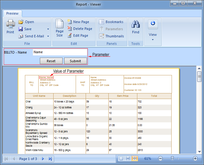
You can use the Border.Side property to set the side on which the border is displayed.
border style
Seven styles of borders are available - solid, dash, dashdot, dashdotdot, dot, double, and none. A simple border applies the selected style to all sides of the border simultaneously. Below are examples of each type of border.

 solid;
 dash;
dash;
 dash dot;
 dash dot dot;
 Dot;
Dot;
 double..
The border style can be selected using the Border.Style property. You can also set the border color and thickness.
border color
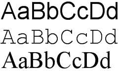
The border color can be set using the Border.Color property. When using a simple border, the selected color will be applied to all visible border sides. The image below shows components with different border colors.
border thickness
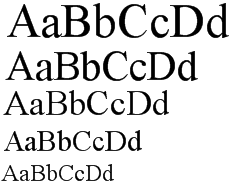
When using a simple border, the border thickness is applied to all visible border sides. The border thickness isBorder SizeCan be set using properties. The image below shows components with different border thicknesses.
Note that the border thickness is ignored when the double border style is enabled.
 Note.The border size is ignored if the Border.Style property is set to the Double style.
Shadow
Components with borders may have shadows. Shadows have three parameters.
 Border. Drop Shadow-Boolean property. If set to true, shadows are visible
Border. ShadowBrush-The brush used to draw shadows.
Border.ShadowSize-shadow size.
shadow style
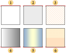
5 types of brushes are used for drawing borders: Solid, Hatch, Gradient, Glare and Glass.
You can combine these styles with other shadow properties to give different looks to your report components. Some examples:
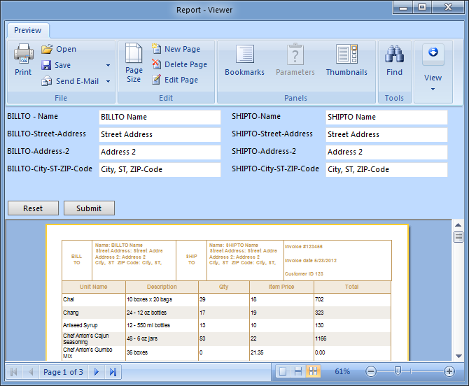
Setting Simple Border Properties
You can set simple Border properties directly from the Object Inspector or using the Borders toolbar.
object inspector
To set properties from the Object Inspector, click the ellipsis button next to the Border property
A new dialog will appear where you can set options for the component's border.
Select the settings you want to apply and click the OK button to close the dialog and update the border.


 English
  Japanese