
The Sparkline component is a visual tool for displaying data. Unlike charts, sparklines do not contain data values, axis labels, legends, and other elements.
To add sparklines to your report, you need to:
 Select the Sparkline component in the toolbox or select the Insert tab in the component group.
Place this component on the report page or data band.
| information |
| When placing a Sparkline component in a data band, you need to specify the relationship between its data sources. This can be done using the Sparkline component's Data Relation property. |
Report sparklines can be of the following types:
Line − The values of the specified data column are displayed as a line graph.
Area − The values of the specified data column are displayed as areas.
Column − Displays the values of the specified data column as a column chart.
Win/Loss - The values of the specified data column are displayed as positive and negative blocks.
Sparkline components can be configured in the following ways:
Using the component editor. (Double click the current component in the report)
Using component properties. Select the component in the report and change the required values in the properties panel.
Sparkline editor
In the current component editor, components are organized visually.
 The Value field specifies the data column based on which sparklines will be created.
 The current field allows you to change the data column for sparkline values.
 The Type field contains controls you can use to change the type of sparkline.
 The High/Low Points parameters are used to display maximum and minimum value markers on the Line or Area sparklines.
 The First/Last Points parameters are used to display first and last value markers on Line or Area type sparklines.
 The Color parameter is used to change the sparkline color. You can specify colors for positive and negative values for Column type and Win/Loss type sparklines.
list of properties
See the list below showing the properties of the current component.
| name | explanation |
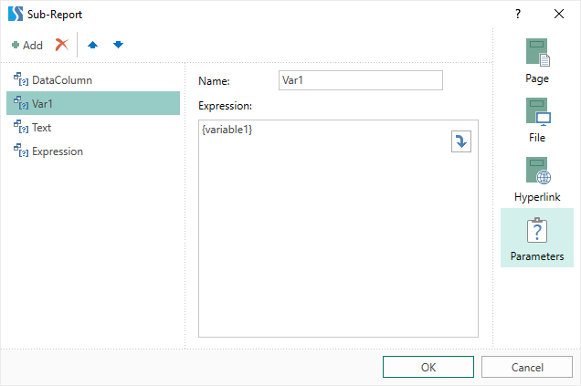
| value data column | This is used to change the data column by the value for which sparklines are created. |
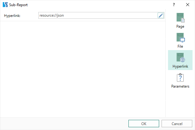
| data relationship | Used to select the relationship between the data band and the data source of the sparkline component. If there is no relation between these data sources, you can create one from the relation dialog by clicking the New Relation button |
| left | Specifies the indentation of the current component from the left edge of the page. The value is specified in reporting units. |
| Up | Specifies the indentation of the current component from the top border of the page. The value is specified in reporting units. |
| width | Specifies the width of the current component. The value is specified in reporting units. |
| height | Specifies the height of the current component. The value is specified in reporting units. |
| Minimum size | A group of properties are used to specify the minimum width and height of the current component. |
| Maximum size | A group of properties are used to specify the maximum width and height of the current component. |
| conditions | Used to invoke the condition editor for the current component. To do this, click the Browse button in the value field of the current property. |
| component style | Used to select a style for the current component. Also in the list of values for this property is a command called Edit Styles that can be used to invoke the style designer. |
| use parent style | Used to apply styles to the current component. This style is applied to the owner component. If the current property is set to True, the owner component's styles are applied to the component. If the current property is set to False, the assigned style will be applied to the component. |
| anchor | This is used to select the binding mode of the current component to its owner component. |
| dock style | This is used to select the docking mode for the current and owner components. |
| activation | Process the current component when rendering the report. If the current property is set to True, the component will be processed when the report is rendered. If the current property is set to False, the component will not be processed when the report is rendered. |
| grow tall | Increase or decrease the height of the component when rendering the report. the current property isT.If set to true, the component will be stretched to the height of the owner component. If the current property is set to False, the component will not stretch to the height of the owner component. |
| Alternating current | Invokes the interaction editor for the current component. Сlick the Browse button for the current property value field. |
| printable | Shows or hides the current component of the rendered report. If the current property is set to True, the component will be visible in the rendered report. If the current property is set to False, the component will not appear in the generated report. |
| Used to specify the display mode of the current component in the rendered report. | |
| shift mode | This is used to offset a component below another component at the same level in the report component hierarchy. |
| name | Used to rename the current component in the report. |
| alias | Used to change the alias of the current component in the report. |
| limit | Sets the permission to use the current component.The Allow Change parameter enables or disables modification of the component.The Allow Delete parameter enables or disables component deletion.Use the Allow Move parameter to enable or disable component movement.The Allow Resize option allows you to enable or disable component resizing.You can enable or disable component selection with the Allow Select parameter. |
| Locked | Prevents or allows resizing and moving of the current component. When the property is set to True, the current component cannot be moved or resized. When this property is set to False, this component can be moved and resized. |
| Link | Used to bind the current location to a report page or other component. If the property is set to True, the current component will be bound to the current location. If this property is set to False, this component is not bound to its current location. |


 English
  Japanese