
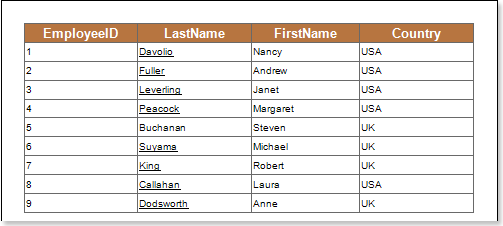
The state of the databar provides an opportunity for visualizing the dynamics of changing the values of the data columns. The data bar condition follows the principle below works. All values in the selected data column are analyzed to determine minimum and maximum values. Minimum corresponds to 0 percent and maximum corresponds to 100 percent. The value of the selected data column is specified when rendering each component to which this condition applies. A percentage of this value is then calculated from the minimum to maximum range. Databars are rendered according to percentages. If the value is close to the maximum value, the length of the data bar will increase. If the value is close to or equal to the minimum value, the databar is barely filled. The following image shows the report page.
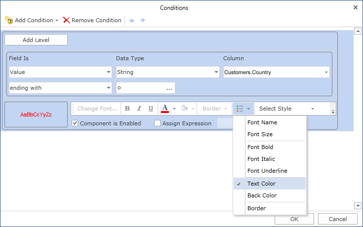
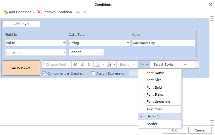
Add a databar condition. To do this, select the text component. For example, select the text component of the {Employees.EmployeeID} expression. Add a databar expression. Change the parameters of the condition. The following illustration shows the Conditions dialog box.
![]() Column field. This field indicates the data column whose values are taken to draw the databar.
Column field. This field indicates the data column whose values are taken to draw the databar.
![]() Type field. Used to change the minimum value type. The following types are available:
Type field. Used to change the minimum value type. The following types are available:
![]() automaticdefines the minimum value of the selected data column and resets it to zero if it is greater than zero. So if the minimum number of data columns is 25 and the maximum is 100. With the minimum number of components, the histogram is rendered 25 percent. In this type, the extreme range of values is 0.
automaticdefines the minimum value of the selected data column and resets it to zero if it is greater than zero. So if the minimum number of data columns is 25 and the maximum is 100. With the minimum number of components, the histogram is rendered 25 percent. In this type, the extreme range of values is 0.
![]() percentageis used to specify the minimum value as a percentage.
percentageis used to specify the minimum value as a percentage.
![]() valueprovides an opportunity to specify the minimum value as a number.
valueprovides an opportunity to specify the minimum value as a number.
![]() Minimum value is, defines the minimum value of the selected data column and does not reset to null. So if the minimum number of data columns is 25 and the maximum is 100. With the lowest number of components, the histogram is not rendered as 25 is the extreme range.
Minimum value is, defines the minimum value of the selected data column and does not reset to null. So if the minimum number of data columns is 25 and the maximum is 100. With the lowest number of components, the histogram is not rendered as 25 is the extreme range.
![]() type field. Used to change the maximum value type. The following types are available:
type field. Used to change the maximum value type. The following types are available:
![]() automaticdefines the minimum value of the selected data column and resets it to zero if it is less than zero. So if the maximum number of data columns is -25 and the minimum is -100. With the maximum number of components, the histogram is rendered 25 percent. In this type, the extreme range of values is 0.
automaticdefines the minimum value of the selected data column and resets it to zero if it is less than zero. So if the maximum number of data columns is -25 and the minimum is -100. With the maximum number of components, the histogram is rendered 25 percent. In this type, the extreme range of values is 0.
![]() percentageis used to specify the maximum value as a percentage.
percentageis used to specify the maximum value as a percentage.
![]() valueprovides an opportunity to specify the maximum value as a number.
valueprovides an opportunity to specify the maximum value as a number.
![]() Maximumdefines the maximum value of the selected data column and resets it to null. So if the maximum number of data columns is -25 and the minimum is -100. At the maximum number of components, -25 is the extreme of the range, so no histogram is rendered.
Maximumdefines the maximum value of the selected data column and resets it to null. So if the maximum number of data columns is -25 and the minimum is -100. At the maximum number of components, -25 is the extreme of the range, so no histogram is rendered.
![]() Minimum value Value field..
Minimum value Value field..
![]() Value field for maximum value..
Value field for maximum value..
![]() [Orientation field. Used to change the direction in which databars are drawn. The following directions are available: Left-to-Right, Right-to-Left Default defines the orientation of the databar according to the right-to-left property of the text component.
[Orientation field. Used to change the direction in which databars are drawn. The following directions are available: Left-to-Right, Right-to-Left Default defines the orientation of the databar according to the right-to-left property of the text component.
![]() Databar parameters. Used to select the brush type (gradient or solid). The positive field is used to change the color of data bars for positive values. The Negative field is used to change the color of data bars for negative values.
Databar parameters. Used to select the brush type (gradient or solid). The positive field is used to change the color of data bars for positive values. The Negative field is used to change the color of data bars for negative values.
![]() Parameters including borders. The border field is used to select the type of border (none or solid). The positive field is used to change the border color of positive value data bars. Negative field is used to change the border color of negative value data bars.
Parameters including borders. The border field is used to select the type of border (none or solid). The positive field is used to change the border color of positive value data bars. Negative field is used to change the border color of negative value data bars.
![]() [sample field. An example data bar is displayed.
[sample field. An example data bar is displayed.
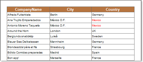
After making changes to the report template, the reporting engine performs conditional formatting of the text components according to the specified parameters. The following image shows a page of a report rendered with conditional formatting.

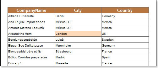
As you can see from the above figure, EmployeeID values contain numbers from 1 to 9. where 1 is the minimum value and 9 is the maximum value. Data bars are then drawn according to the dynamics of the changing values.
negative value
The data column from which the values are taken when viewing the histogram may display both positive and negative values. In this case, the analysis of all values of the selected data column is determined by the minimum and maximum values. The minimum value is 0 percent and the maximum value is 100 percent. Then determine zero. That is, start with a histogram of negative and positive values. For example, the minimum value is -1, but the maximum value is 3. That is, the percentage of negative values in the absolute value of band reception is 25% and 75% is positive. Therefore, the first part where the histogram is created is 25 percent of the component length from the left boundary and 75 percent of the component length from the right boundary (left-to-right direction of the histogram). Histograms with negative values are rendered in negative-chosen colors, and histograms with positive values are rendered in positive-chosen colors. The following image shows an example report rendered with negative and positive values.
The following image shows an example report rendered with negative and positive values.
As you can see in the picture above, the text component changes its background color according to the color scale values.


